短代码
短代码是 MWordStar 主题提供的一种特殊语法,通过短代码可以插入一些特殊样式的内容。
MWordStar 主题的短代码使用的是类似于 WordPress Shortcode 和 BBCode 风格的方括号语法。
常见的短代码类似:
[alert]提示框[/alert]
[alert type="info"]提示框[/alert]
其中的 type 是样式属性,内容包裹在两个方括号的中间,结尾的方括号会有一个 / 结尾符,类似于 HTML。
目前支持的短代码还不多,后续会增加更多。
提示框
下面是提示框的语法:
[alert type="primary"]Typecho博客主题primary[/alert]
[alert type="info"]Typecho博客主题info[/alert]
[alert type="success"]Typecho博客主题success[/alert]
[alert type="secondary"]Typecho博客主题success[/alert]
[alert type="danger"]Typecho博客主题danger[/alert]
[alert type="warning"]Typecho博客主题warning[/alert]
[alert type="dark"]Typecho博客主题dark[/alert]
效果如下:
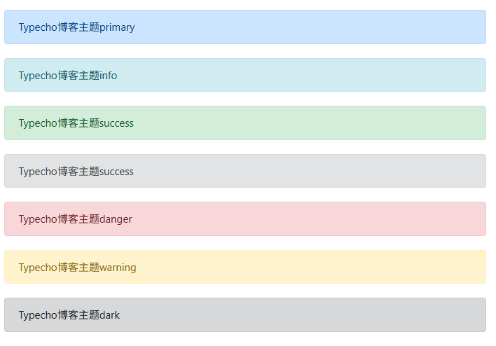
不加 type 属性默认使用 primary 样式。
链接按钮
链接按钮就是按钮样式的链接。
下面是链接按钮语法:
[button url="http://example.com" type="primary"]按钮primary[/button]
[button url="http://example.com" type="info"]按钮info[/button]
[button url="http://example.com" type="success"]按钮success[/button]
[button url="http://example.com" type="secondary"]按钮secondary[/button]
[button url="http://example.com" type="danger"]按钮danger[/button]
[button url="http://example.com" type="warning"]按钮warning[/button]
[button url="http://example.com" type="dark"]按钮dark[/button]
链接按钮样式如下:
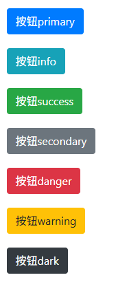
url 里就是链接地址,不加 type 默认使用 primary 样式。
折叠框
折叠框是一种可以展开和收起的内容容器。
下面是折叠框语法:
[collapse title="点击查看折叠内容"]
这就是被折叠的内容。
[/collapse]
折叠框样式如下:

title 是折叠框显示的标题。
徽章
徽章是一种外形类似标签的元素,经常逛 Github 的,对徽章 badge 应该不陌生。
下面是徽章的语法:
[badge type="primary" url="https://www.misterma.com"]徽章primary[/badge]
[badge type="secondary"]徽章secondary[/badge]
[badge type="success"]徽章success[/badge]
[badge type="danger"]徽章danger[/badge]
[badge type="warning"]徽章warning[/badge]
[badge type="info"]徽章info[/badge]
[badge type="light"]徽章light[/badge]
[badge type="dark"]徽章dark[/badge]
徽章样式如下:

type 是样式,不加 type 默认使用 secondary 样式。
url 是可选的链接地址,不加 url 解析为 span 普通文本,加 url 解析为 a 链接。
隐藏内容
主题提供的隐藏内容可以实现让文章的部分内容隐藏,可以设置为登录才能查看,或者评论才能查看。
下面是隐藏内容的短代码:
[hide type="comment"]隐藏内容[/hide]
[hide type="login"]不让看[/hide]
隐藏后的效果如下:

type="comment" 需要在文章页发送评论,评论通过审核后才能查看,登录也能查看。
type="login" 只有登录才能查看。
不加 type 默认是评论查看。
进度条
下面是进度条短代码:
[progress type="primary"]60[/progress]
[progress type="secondary"]60[/progress]
[progress type="info"]60[/progress]
[progress type="success"]60[/progress]
[progress type="danger"]60[/progress]
[progress type="warning"]60[/progress]
[progress type="dark"]60[/progress]
进度条效果:

type 可以设置进度条样式,不加 type 默认显示 primary 样式。
进度条的进度数字包裹在短代码中间,进度数字不需要加 %。